A personal project I created with my business partner Elena Villares. A jewelry brand designed by us. Handcrafted in Sri Lanka ethically and responsibly with traditional techniques, using natural gemstones and silver.
All the work developed in Edein Jewels was done by ourselves, such as brand identity, eCommerce design and development, editorials and product photography, newsletters, graphic elements for social networks, even the displays of jewelry that we use in the artisan markets in which we participate.
Unfortunately, the Covid pandemic and travel restrictions blocked our little project and for now, it is on standby in the hope of being relaunched.
A well-integrated online store with social marketing tools.
For Edein Jewels we have designed and developed an eCommerce using the WooCommerce CMS.
It is a store that has the most advanced tools for connecting with Instagram and Facebook shops, Goolge Merchant, etc. and also SEO.
User research.
I started the UX Process by conducting exploratory user research. I created a discussion guide to talk to 40 people about their jewelry online and offline purchase experiences. The aim was to get a better understanding of what people look for when they buy a jewel, what are some things that make it memorable, and what would have made their experiences even better. I Interviewed them through a WhatsApp group and one-in-one chat and took notes as I went. With the information I gathered, I was able to gather commonalities and establish personas. Here are a few interesting findings from the interviews:
Customers want to be sure of their purchase.
Several criteria are important to them: other clients’ reviews, price, price delivery, return conditions, precise information on the product (size, material, gemstone).
To buy a jewel the word of mouth works well. It’s easier to buy from a website that a friend has told them about. They were less afraid to make a mistake.
Most of the time, when they go online to buy a jewel, they already know what they want to buy. It’s to save time, to avoid queuing into shops or simply to avoid moving.
When customers go to a shop it’s because they need advice or to try the jewel. It concerns value purchase because the risk of doing a wrong choice is bigger.
Some products are difficult to shop online such as rings or earrings because it’s complicated to know how they really fit.
Afinity map.
After speaking with 30 people about their experiences with online and offline purchases, I wrote down their responses and grouped them into categories of gender, age, jewelry design preferences.
After I grouped them, I placed a dot on the group to represent the number of times that answer was given.
I was able to identify the most popular responses for each question and identify trends and patterns in the way people buy jewelry down into specific demographics.
80% of women buy jewelry for herself.
95% of women values the procedence of the jewel.
100% of men over 50 buy jewelry sets.
75% of men over 50’s choose classic jewelry designs.
60% of men around 30’s buy jewelry sets.
55% of men around 30’s buy modern jewelry designs.
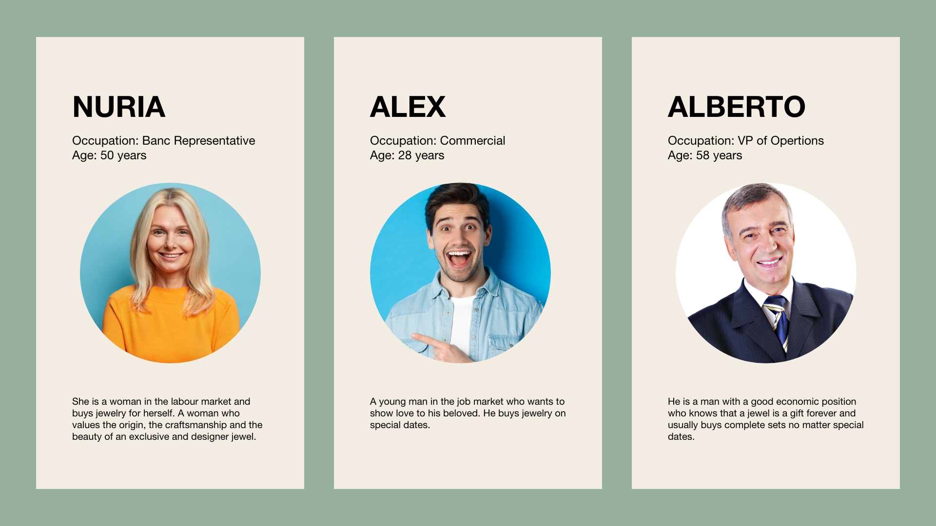
Personas.
Based on the affinity mapping exercise, I was able to identify 3 personas that would be the most likely to buy online. The personas gave an overview of their purchasing attitudes, jewelry design preferences, and motivations for buying a jewel with a brief description of their demographics. I didn’t get too elaborate with the personas at this point because I only had preliminary data, and I wanted to allow room for the personas to evolve as I find out more during testing.
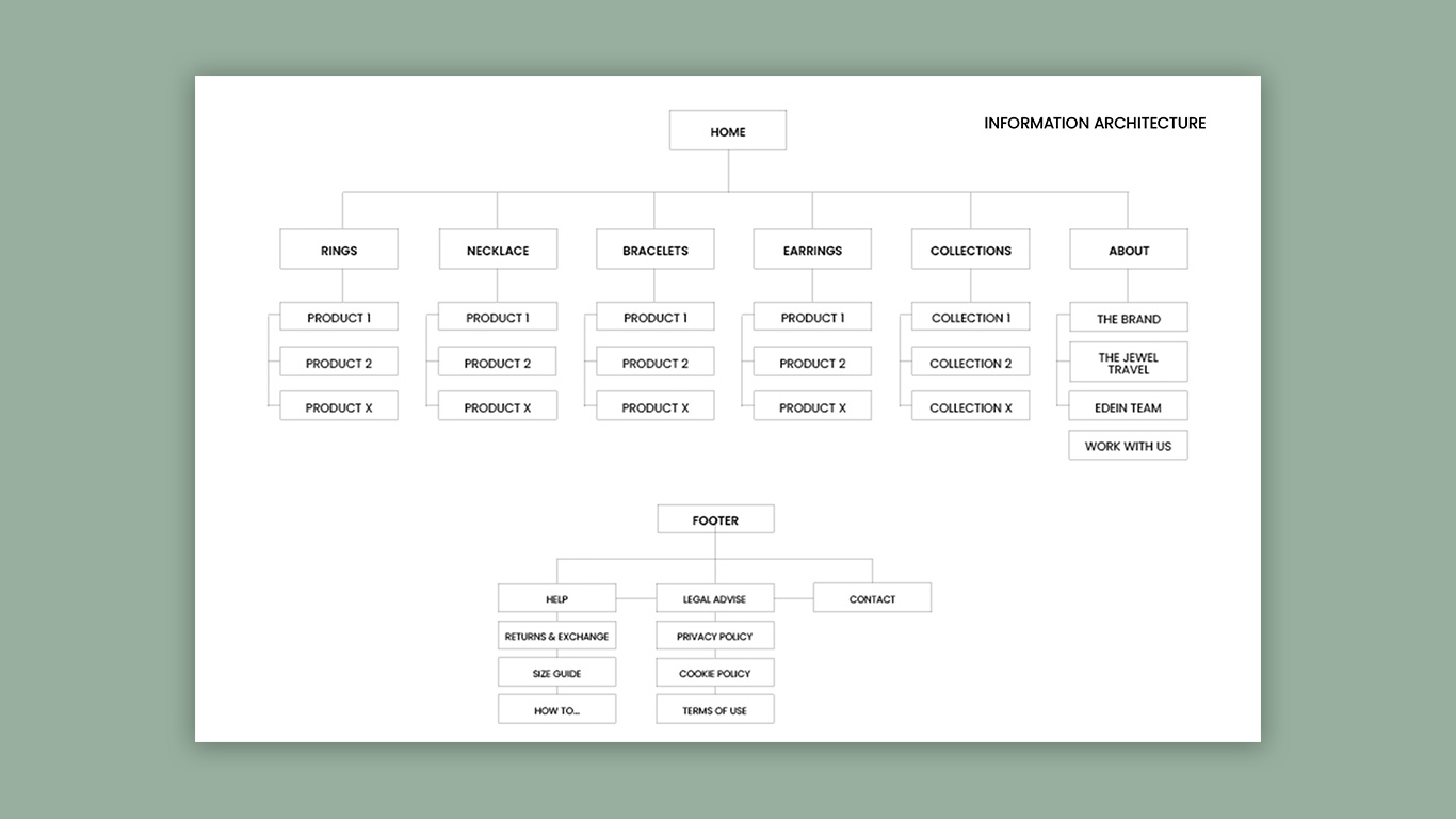
Site map.
I have started with the basics that a jewelry e-commerce should contain and organized it. Throughout the project I had to update it until it became the final version.
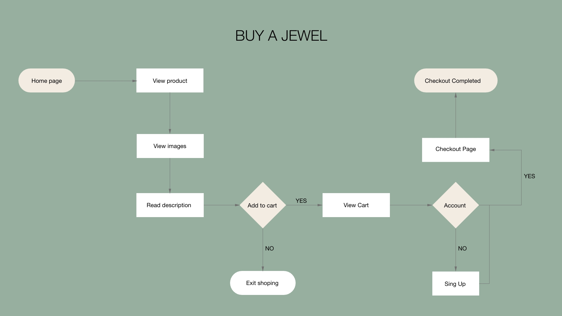
User flow.
A map that defines how the user can accomplish a simple purchasing a product task was created. It is useful to meet the needs of our target users, as well as the needs of the business.
Use case and Scenarios.
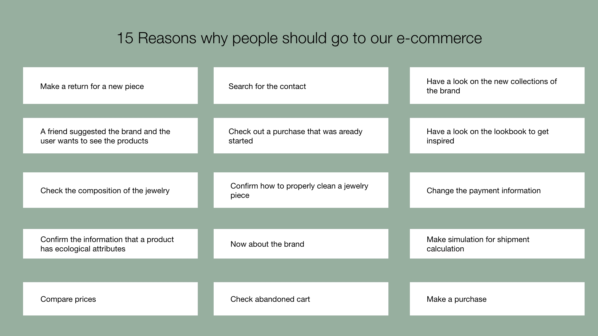
A list of reasons to why people would visit the e-commerce I was designing was created.
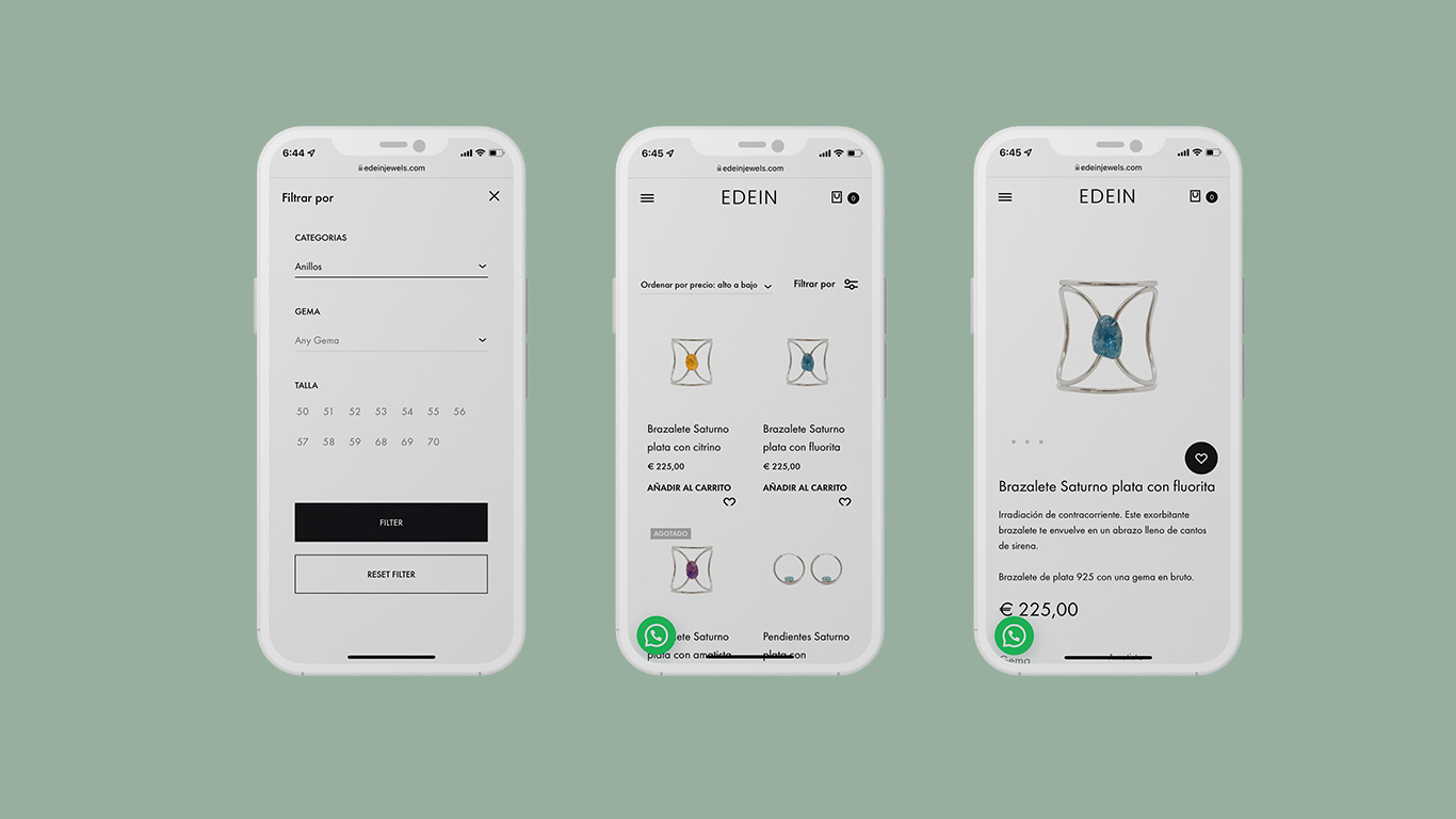
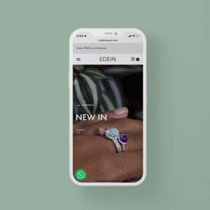
Mobile first.
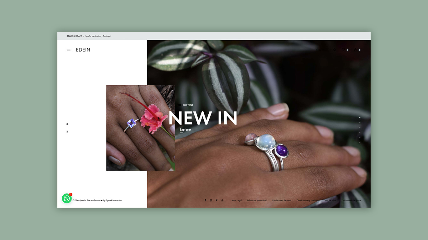
The entire website was designed for mobile devices first. A minimal design user interface and clean use of typography were used to give the website a fresh and elegant look.
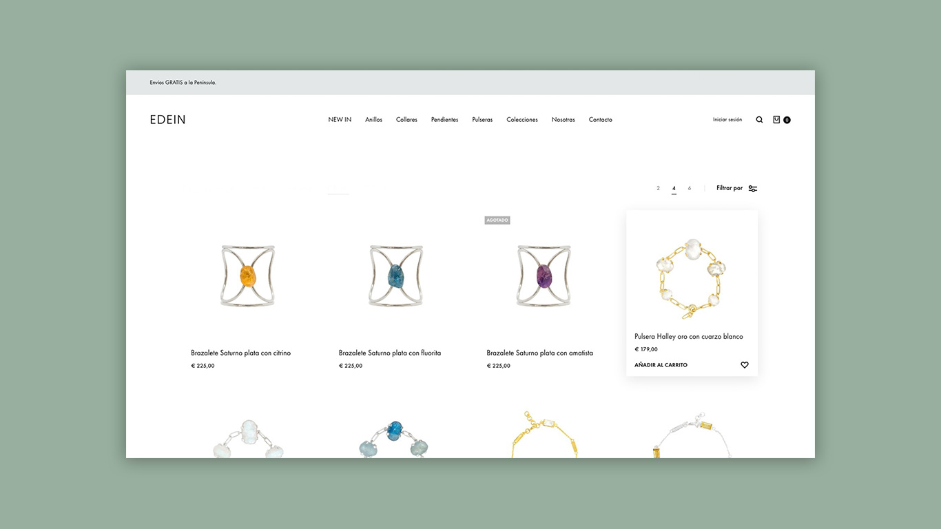
White, black and simplicity.
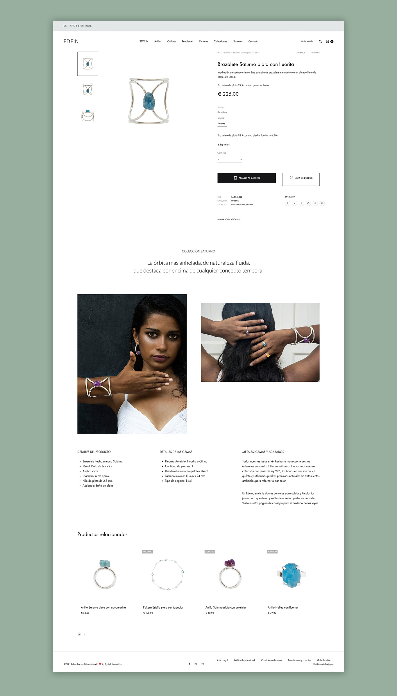
Emphasis has been placed on the UX so that the user can easily find the products. Product pages are based on detailed product images with a clean layout and simple, intuitive navigation.
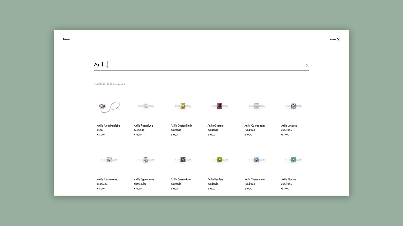
Easily find what you are looking for.
We have not revolutionized the search engine, far from it. But instead of offering a basic search area, we have tried to improve this experience by making it more immersive. The goal is always to bring the product as far forward as possible.
Everything in proper place.
We have divided the products into categories taking into account the needs of the user, but also taking into account a SEO approach. Each collection page is complemented by a visual dedicated to the product and a text for SEO. In this way, the site is optimized for optimal natural reference.
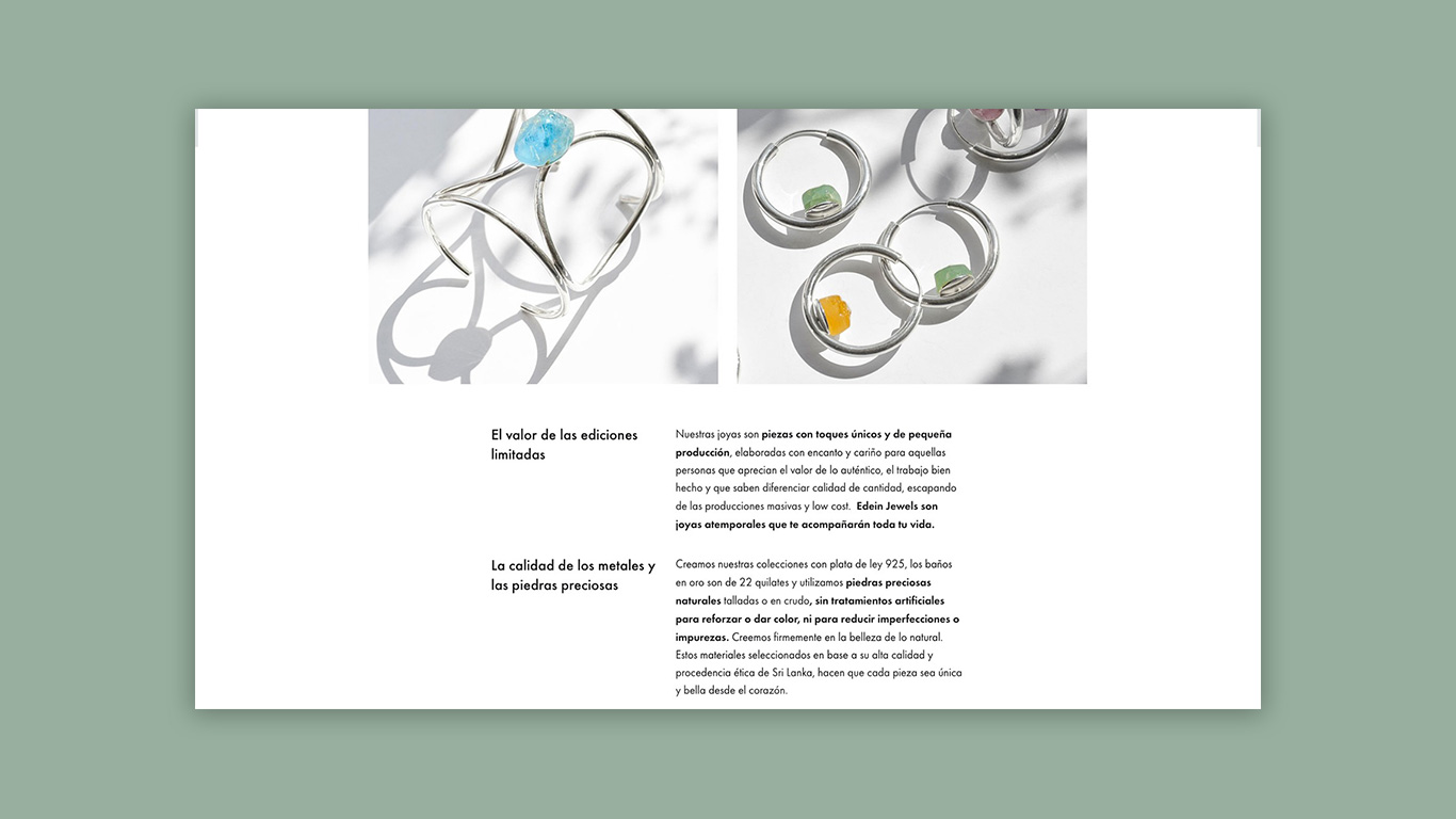
Detailed product pages.
To guarantee that the products are of high quality and that they are manufactured by hand, every detail, every material is presented on the product sheet, so we also have an SEO approach.